Showing posts with label Color of the Year. Show all posts

Wednesday, January 13, 2021

Why Pantone Colors Ultimate Gray & Illuminating Don't Work for Me

A Big No - Ultimate Gray & Illumnating
When it comes to colors for the Dunitz & Company's fair trade jewelry collection, I have strong opinions. I've been designing for so many years, and I just know that Patone's Colors of the Year, Ultimate Gray and Illuminating (a bold shade of yellow) absolutely do not work for our jewelry collection. Perhaps people feel gray after a year in quarantine. It doesn't mean they want to wear their mood. And bright yellow has been described as a hopeful color; a ray of sunshine. I'm afraid that most skin tones are just not suited for yellow. And together? No. No. No. I don't think this is a winning combination at all for fashion jewelry. I'm not even going to try and convince you that I was prepared for this trend and can pitch items in our collection that hit the mark. In years past when clothing designers were high on yellow, I jumped on their bandwagon. Guess what? For us, bright yellow has always been a flop. Gray on the other hand combined with lavender or sea foam is often a huge win. But never with yellow. [Note to reader. I made a conscious choice not to share yellow disasters from Dunitz & Company's past seasons.]

So, let's talk a little bit about yellow and gray! (My instinct is to spell that grey. Both are correct. Just saying. Since Pantone uses the "a", for this post I'll stick to it.) In fact, I'll actually address each, as it applies to Dunitz & Company's Spring 2021 offerings. 

Dunitz & Company Fair Trade Earrings
Pale Gold & Mint Teardrops
Brash Illuminating Yellow. Never. However, creamy egg-shell yellow, gold, pale yellow, light amber... there are variations that definitely work. And for Spring 2021, Dunitz & Company offers this pale golden yellow with mint color combination. We hope you'll like it. I think our necklaces, bracelets and earrings in these colors will be a terrific addition for a beachy Boho vibe outfit. And folks, this is all you get from Dunitz for the upcoming season in "yellow."


One more important note about me, I want my readers to know. I adore bright yellow. Just not typically for fashion jewelry. You should know that I had my house painted yellow and have stuck with this same Aspen Yellow from Dunn Edwards for well over 20 years. When the sun shines directly on the house, it appears quite lively. And for conversation purposes, I always choose a photo that includes our Doberman mascot, Stetson!.


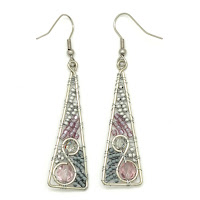
Dunitz Silver and Purple Triangle Earrings
Gray & Lavender Earrings
Back to Jewelry... Gray? Yes, but never solo. And definitely not with yellow.  This season in fair trade beadwork, we're pairing gray with silver and lavender. With a hint of purple, we want you to think about Spring flowers. And shades of purple are always so magical. I want you to think about unicorns, not drab concrete or an old comfie worn out blanket. I didn't just come up with that. I read an Art News article that mentioned the blanket.
 
 
Dunitz Fair Trade Glass Earrings
Gray Glass Earrings
I'm using gray in three color combinations for our Joanie M glass jewelry collection for Spring. One combines gray with a snowy white and a hint of "classic blue" AKA Pantone's 2020 color of the year.   Another pairs gray with sapphire blue and a splash of silver. And finally for a bit more vibrancy, I've matched up gray with some aqua and pale emerald.
 
 
Here's one more the thing. All of my design work and color planning for Spring 2021 was completed before Pantone announced their Colors of the Year this past December. I stick with my choices for our fair trade jewelry collection. I'm not experiencing even a tad of trepidation for not having a Ultimate Gray & Illuminating color combination. -ND

Thursday, December 26, 2019

Hooray for Classic Blue - 2020 Color of the Year

You've heard me time and time again say that blue has always been Dunitz & Company's best selling color. And dark deep ocean blue (aka Classic) has always been right up top. What was Pantone waiting for? I've been designing and offering fashion jewelry since 1990, and it's only this year that "Classic Blue" has been named "Color of the Year?"  I think it should be crowned Color of the Decade! Or perhaps the Century.


The fashion mags are already having a field day showing off how you can wear blue all year long. Did Pantone not know that we've already been wearing deep shades of blue all year long, every year? We didn't need prompting. My guess is, is instead of anointing colors like Living Coral (2019) or Ultra Violet (2018), they'd choose a color that was safe and stable for people during these somewhat turbulent times.You can interpret what I mean by turbulent. But, heck, Classic Blue is like eating meatloaf, it's comfort food all the way.

Vogue magazine editors jumped on the bandwagon quickly. It was the first post I read featuring clothing from the Spring 2020 runway shows featuring shades of classic blue. Of course, all of the well known designers had created their offerings long before Pantone announced their queen color. Like me, the likes of Gucci, Marni and Marc Jacobs always know the masses love dark rich shades of blue.

So, now I get to act really smart. Dunitz & Company will have lots of classic blue for Spring 2020. Our newest colors will launch next month at the wholesale gift shows. Dunitz will debut our latest designs in all of our new colors at the LA Mart Temporaries and NY NOW.  But here are a few advance teasers for you all.

Our glass jewelry is always a crowd-pleaser. And I proudly state that these wonderful color combinations that include peaceful, safe and comforting blue, were all created long before Pantone's announcement. Gosh we're smart!


Are you a fan of Dunitz & Company's beaded jewelry? I'm guessing you might be since you're reading our blog, and we've been offering seed bead jewelry for almost 3 decades. Yikes. Yes, THREE decades. Dunitz will offer several new color combos with the flair of blue. These two show off a dash of classic. Smirk. Smirk.


Can I stretch the story further? How about paintings for the millennium that sing of classic blue? The most famous paintings of all time for your ears. The Wave & Starry Night. These are some of our best sellers. For that reason, I'll take any opportunity to put them smack dab in front of your face. Perfect for museum shops, hipster boutiques and your ears!


So there you have it. Hip Hip Hooray for Classic Blue.  Dunitz & Company is all about this rich, safe, homey, comfortable color we just want to wrap our arms around.  Find it in a store near you this season. And of course, we hope your choice will be our fair trade jewelry! -ND

Wednesday, December 12, 2018

What I Say about Living Coral - Pantone's 2019 Choice

My color planning and choices for Dunitz & Company's fair trade jewelry for the upcoming Spring season have been long put to bed. Shades of deep orange have been super popular for Spring clothing for several years now.  And 2019 projections seem no different. Many of the designers whose names we easily recognize decked their models in vibrant variations of coral for this Spring's runway. It's no wonder that after several years, Pantone has named "Living Coral" their Color of the Year.

I have mixed feelings about this. What I've learned is our customers don't always follow trends when it comes to purchasing their jewelry. Because "Coral" was so big in clothing the last few years, Dunitz & Company chose to offer jewelry in similar shades. Check out Bev in our photo to the right. This pic is from a couple of years ago and she is, yes, outfitted in "Living Coral". She's a stunner. The jewelry is stunning. Truth be told, this color way has never been a particularly good seller for us. Why do I offer it? There's always a small group of women that adore (and purchase jewelry in) coral. Also, our customers NEED choices. Offer them coral. They'll buy the aqua blue. (Yes, "shades of blue" always win over Rose Quartz, Serenity, Greenery, Ultra-Violet, and I'm sure Living Coral.)

So, what's a jewelry designer, whose collection is based on color to do? Dunitz & Company's Spring 2019 colors were chosen and created long before Pantone made their recent announcement.  And somehow, I'm right on track. A great track, I think.  Each year we offer 12 different color ways in our seed bead and our Joanie M fused glass collections. You better believe that a majority of our offerings include various hues of jade and sapphire. Did I say blue sells?  But if you were reading, you also read that other colors sell albeit in smaller quantities. Offering many choices always our customers to reaffirm their favorites.

Guess what? Dunitz & Company is offering variants of Living Coral for Spring 2019. In our popular fused glass line we'll have some stunning pieces in what I have lovingly referred to as a dark melon shade. Perhaps I should now call it ‘Living Coral’ so I sound as if I'm in the know.  For production, I call it "Color #128". What do you think? Even without Pantone's announcement, Dunitz & Company is right on the pulse.


For our beaded jewelry, I was particularly influenced by the recent Emilio Pucci runway. Several of Pucci's fabrics combined wonderful shades of dark melon (aka Living Coral) with various shade of pink and in some cases, splashes of turquoise.  That inspiration resulted in, yes production "Color #363". I chose a strong bead that more resembles the inside of a cantaloupe and coupled it with pale nectar and the never-ending popular millennial pink. Sure hope our customers love it as much as I do.


As I was getting ready to complete this post, I received an email sharing Dayna Isom Johnson's (Etsy's trend maven) most recent blog entry.  She has anointed Etsy's Color of the Year as "Burnt Orange". Where I see her choice a bit dark for Spring clothing and jewelry, it sure follows suit. Similar color. Same family. Stay turned to the Dunitz Etsy Shop and you're sure to find some Living Coral, Burnt Orange, Cantaloupe, Melon colored options.


So there you have it. My two cents about Living Coral and Pantone's 2019 choice.  Keep your eye on Dunitz & Company's fair trade jewelry.  If you're a retailer, our Spring 2019 collections will be up on our wholesale site soon.  Looking to buy for you? You can easily do that too. We're here to help. Did you know our websites also have a store locator? Perhaps there is a retailer near you where you can see, touch and feel our jewelry before purchasing.

Tell me what you think about my thoughts on Living Coral. I'd love to hear from you. - ND

Monday, December 18, 2017

More About Pantone's Ultra-Violet

There are so many influencers of fashion design and the colors used in fashion. I've always thought the most well known "international" designers (think Calvin Klein, DKNY, Stella McCartney etc.) cast the greatest directions. I've been told these designers are working two years ahead in many cases. Dunitz & Company starts working on new fair trade collections about six months ahead of their fair trade jewelry release. And then there is Pantone making their announcements of color long after the rest of us have done our work.


I've been at the design game for a long time. Often, I dream of color combinations. Most often I am inspired by the ready-to-wear runway shows. I watch them avidly for inspiration. I also have noticed over the years that color trends gradually evolve and disappear. For instance, shades of grey have dominated for as much as three years. In recent years all shades and tints of jade seem to persist. This has allowed Dunitz & Company the opportunity to repeat successful color combinations. Shades of grey or silver with jade and seafoam ....just isn't going anywhere. And then there is PURPLE!

With our fair trade jewelry collection, I tend to always offer twelve colors. With our lower-end jewelry, our gift shop customers are more successful when they can offer their clients a potpourri of colors. For the upcoming Spring 2018, our plans were no different. New to my color range for Spring and one I'm most excited about is Black/Silver/Crystal. There seemed a plethora of black & white on the New York runways. And after I finished my colors this season, I thought something is missing. Guess what that was? Yes. Purple. To round out our fused glass and beaded collections we added some amethyst and plum. And in a few cases combined with lime or grass green.


Flash forward. December 2017 and after all of those "international designers" I mentioned earlier have launched their Spring 2018 designs, Pantone crowns ULTRA-VIOLET color of the year for 2018. Seriously? Leatrice Eiseman is viewed as the goddess of color. And clearly, everyone is scrambling. Harper's Bazaar immediately wrote that many designers including Tom Ford and Michael Kors were showing more flattering shades of amethyst for Spring 2018!

So why did Pantone choose ULTRA-VIOLET as their color? Eiseman is quoted here, "We are living in a time that requires inventiveness and imagination. It is this kind of creative inspiration that is indigenous to Ultra Violet, a blue-based purple that takes our awareness and potential to a higher level."  Pantone's website suggests Ultra Violet is focused on the mysteries of the cosmos,  the intrigue of what lies ahead and discoveries beyond.  Enigmatic purples have also been symbolic of counterculture, unconventionality and artistic brilliance. Seriously, who is Pantone hiring to write this stuff? I'm afraid to say that purple is also the color of kings or those that think they are king.


Pantone has joined the Facebook advertising craze and is actively sponsoring posts about their 2018 color choice. And Facebook strollers are eating up the announcements. ("I better paint my walls purple now." "I bought a dark purple shirt last week. I'm way ahead." and the comments go on and on and on.)  You better believe Pantone is successful in creating trends. I'm sure many an "international designer" is masterminding how they can cut some last minute garments for retailer racks.


Bloggers and top magazines and publishers are grabbing at straws. Nylon and New York Times and every other magazine last week launched articles with found photos of perfect purple clothing and accessories for your 2018 wardrobes. I'll almost guarantee that their next printed editions will offer the same.


Even the stylists on NBC's Today Show were in on the act this morning. Both Savannah Guthrie and Hoda Kotb were decked out in 'Ultra-Violet' clothing. I tuned in late. I have no idea if they featured a story today on this recently crowned shade.


I'd like to say that I was on the pulse in advance of the Pantone announcement. The truth is, as mentioned above, I added 'shades of purple' to our 2018 Spring collection, because it was needed to round out our offerings. Honestly, I would have never guessed "Ultra Violet" (AKA dark Purple) would be bestowed such an honor. But heck, Dunitz & Company is ready for you. Our fair trade fused glass will shine this season with our color 88 (a repeat of amethyst and violet) and our new color 117. This luscious combo marries plum with lime.


Our newest bead-work color 354 joins amethyst and violet with various shades of spring green. We think you'll love it. It's bright and perky and makes one think of new growth and flowers. One might suggest that this combination is the perfect coupling of Pantone's 2017 color "Greenery" with their 2018 queen, "Ultra-Violet".


Dare I say sometimes these projections don't equal sales or popularity. Somehow, 2016's Rose Quartz was a big bust. In the meantime, if you want to fit in, you might look to Allure magazine's suggestion. After the Pantone announcement, they offered new hair coloring as a way to blend in!


What are your thoughts on this topic? -ND